How can you paint this watercolor step by step
Hi!
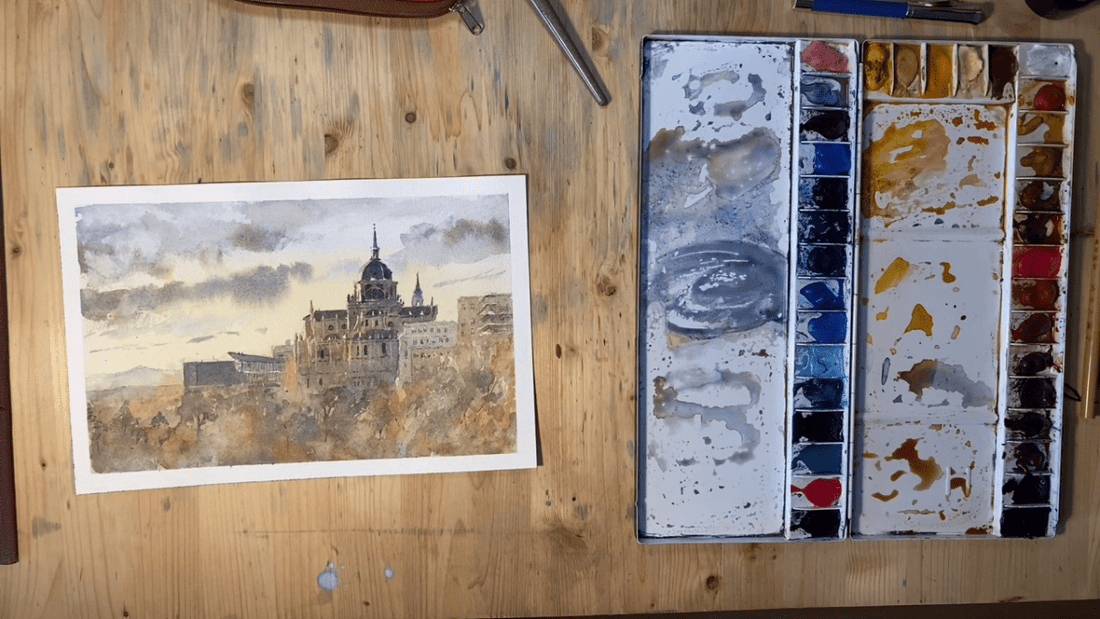
You can learn to paint with me on my Patreon channel . In the meantime, you can also try following this step by step explanation of this Painting I did about one of my favorite places in Madrid :)
1 Drawing: I make a simple drawing, trying to compose the drawing in an appealing way (the rule of thirds). I add a few details that I think are important but all and all it's a simple drawing.


2. First wash: I add the first wash, the "light" color. Cobalt blue and isoindoline yellow as I go down. I add some quinacridone burnt orange as I move to the ground and add again some cobalt blue to cool the ground even a bit more. The cobalt blue and orange mix on the paper and it creates a warm gray on the paper.

 3. I mix some isoindoline yellow and cobalt blue in order to get a warm gray that I use to make some clouds. I paint them wet on wet so that they blend in with a soft edge. Parts of the paper dried fast though so I need to soften some edges using paper tissue.

 4. I start painting the main building of this painting using the same mix of Isoindoline yellow and cobalt blue. The mix is now a bit thicker than it was before. This is painted wet on dry paper. I vary the mix as I move through the building either adding more blue, yellow or a bit of orange to suggest bouncing light in the shape I am painting. I am careful enough to leave some gaps here and there to preserve building highlights.

 5. As I move to the ground I add a perylene green to the mix, and some quinacridone burnt orange. I mix them organically on the paper surface and I splash some water to give texture. This is the tree area of the painting so I need that texture to suggest movement.

 6. With a thicker, darker mix using ultra blue and burnt sienna, I add important details in the building, mainly windows. I also define the buildings nearby. I used a base gray mixing cobalt and burnt sienna then added the brick texture on top using burnt orange and venetian red.

 7. I start adding trees by using perylene green mixed with a bit of quinacridone gold on one hand, and some burnt orange on the other to create a texture that suggests either illuminated or in-the-shadows trees. I indicate the trees with an abstract texture and worry only to add certain details, like specific tree shapes, trunks or branches in small areas, to enhance the illusion.

 8. Small details here and there, and the painting is done.

 Hope you liked this step by step process. Full video on my Patreon.
Have a good one!